My first week "at school" is over.
New media is an interesting thing, it's just hard to describe what exactly is studied in each individual subject :)
Over time I'll tell you about my studies and each subject in more detail, and today I'll tell you about the subject "typography basics". For me this is an optional subject, so you can consider it's for pleasure.
While I was preparing for admission, I read a couple of short books about typography and fonts in general, and I really liked the very idea of creating fonts. All probably because my life is strongly connected with different languages, and therefore writing systems. What's it worth that quite recently I was learning cuneiform.
I wanted to learn more about typography. Maybe it's my destiny to create at least one normal Cyrillic font.
I signed up for the subject "introduction to typographic work". The class is on Friday morning, the first lesson just recently took place.
In the first class they asked about experience, why we signed up for the subject and all that. I'm again the only foreigner, which is strange, previously in the subjects I signed up for, there were at least a couple of Russian-speaking students, and now I'm a lone warrior.
I'm still amused when you talk with a teacher for a couple of minutes, answer questions, tell what a great guy you are, and then the question "you understand Czech, right?". Da, panimaju nemnoho :)
Then we talked about basic terminology. In Czech typography the terms turned out to be wildly funny, and even few Czechs could guess what this or that word means.
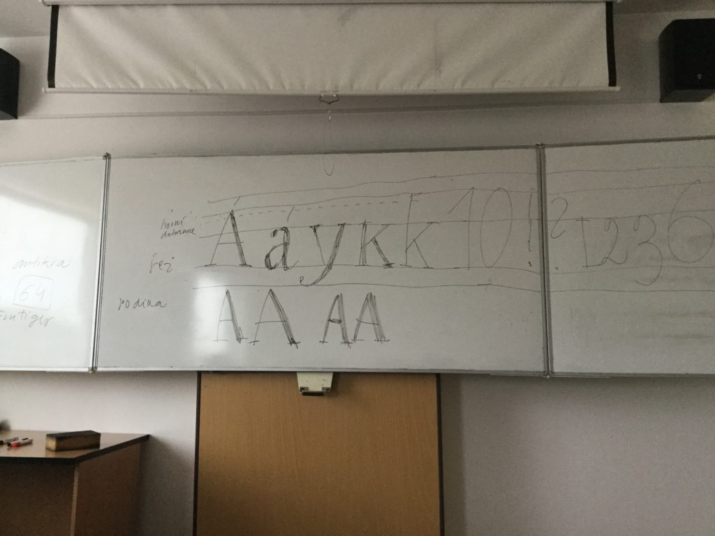
Speaking of terms in typography - there are generally funny people sitting there, as I understand. What's it worth, for example, a really existing term in Russian "bitch line".
At the end of the lesson we were shown a couple of examples of business cards, and we learned to immediately describe the font that we see on this or that card. Something like "here's grotesque in capitals", which translated into human language means "here everything is in capital letters, sans-serif font".
For homework we were asked to write our name on an A4 sheet so that it would be visible from 1.5-2 meters. We need to make 2 versions - classic and somehow creative. I'll need to show myself right away, Comic Sans to help me.

I also noticed a funny pattern: the teacher can beautifully draw a letter (in 10 seconds she could quite decently draw both shadows and stroke thickness), but her handwriting is generally wildly incomprehensible. How is that even possible.